Everyone Hates The Met's New Logo, But They'll Still Go, Right?
It started with Justin Davidson's Vulture review of The Metropolitan Museum's new logo, who called The Met's new logo a "graphic misfire" that looks "like a red double-decker bus that has stopped short, shoving the passengers into each other’s backs."
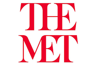 Adweek panned it as a "letter-killing, article-elevating, butt-filled logo" and responded with one word upon viewing Wolff Olins's concept samples. Brand New has weighed in, as has Art Net News.
Everyone loves to hate logos, which makes sense. I hate logos too: we spend way too much time arguing over marks, defending them, decoding their meaning. I'd rather talk about how an organization treats us, what it says to us, how it make our lives better.